One of the main aspects of marketing I believe is the image that you put on the flyers and the poster. This is the first thing that an audience member will see of your show, so it needs to be interesting enough to get an audience intrigued but it must also not be too far away from your show.
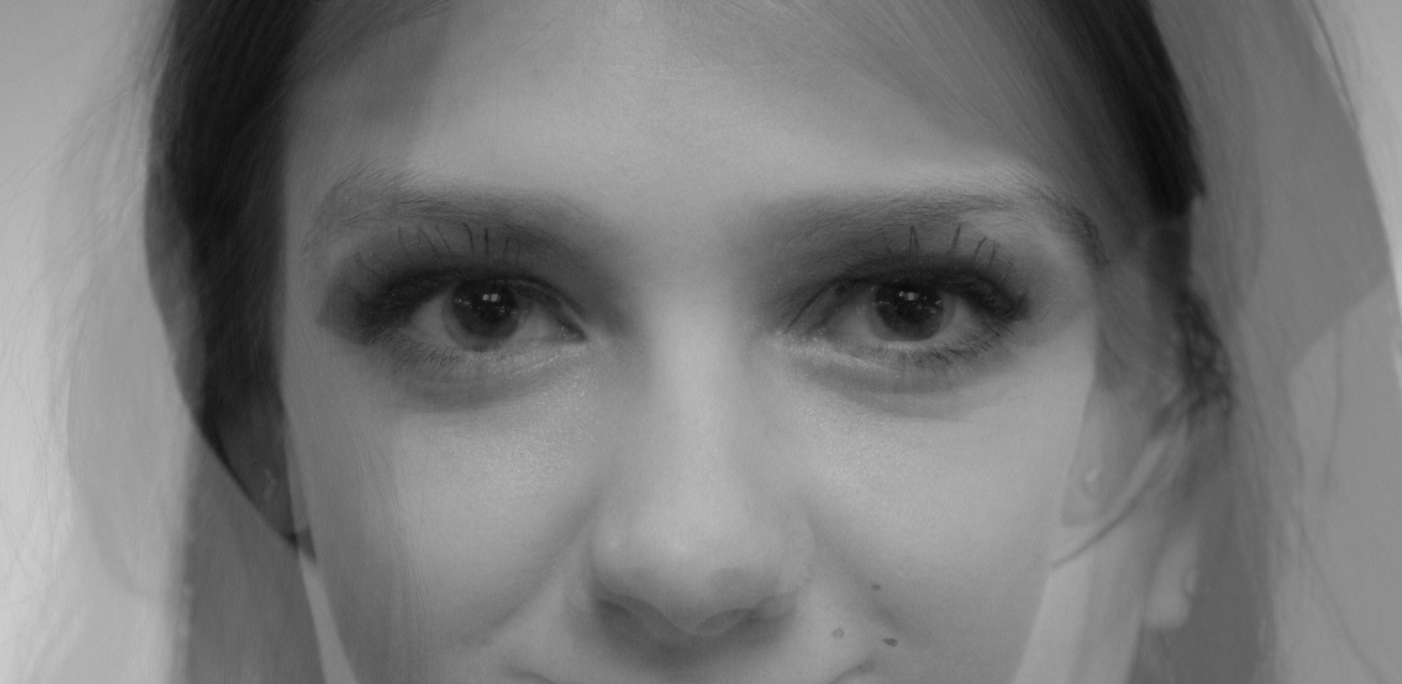
The initial idea that I had for the image was to have a photo that layered all 5 of the actresses faces to show that there were 5 women playing one character, but also to have a hint of the chaotic mind of someone with a mental illness.
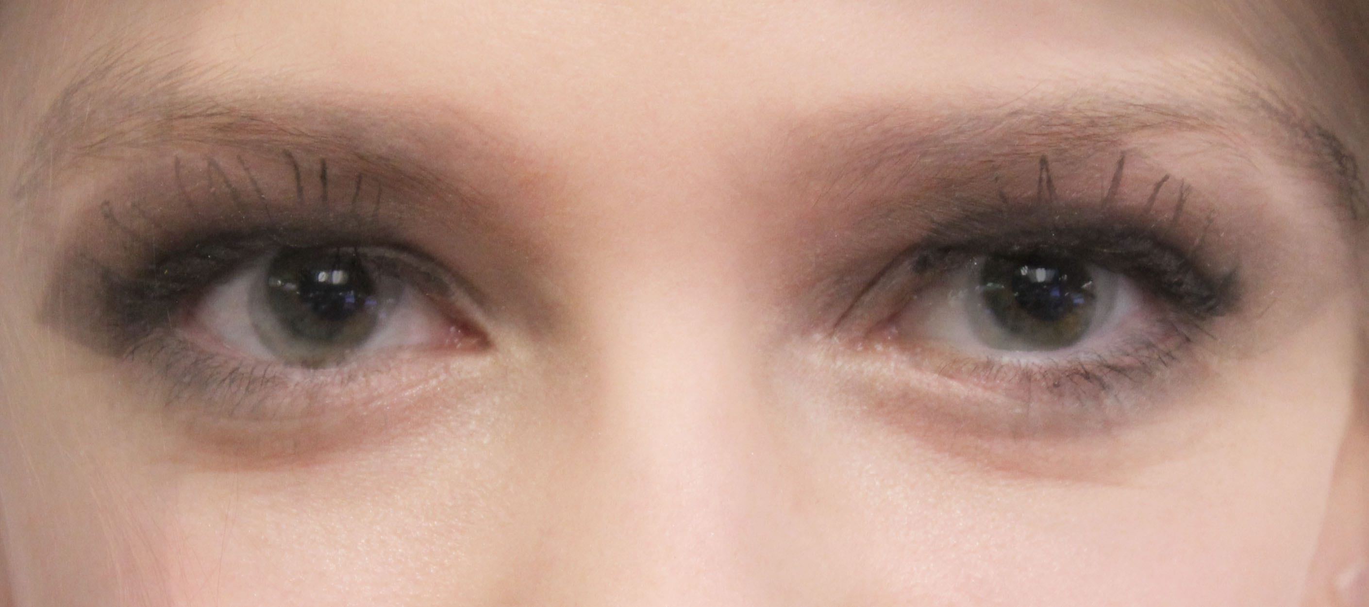
The first step was to take the photos, Charley are technical designer took these photos. I wanted to make sure that all of the eyes were going to match up so when they photos were layered there would be a focus point.
Before sitting down to edit the photos I had not really used Photoshop so it took a little bit of time to get used to the software.
Once finishing my initial idea, I decided to play around with different ways of editing the photos together.

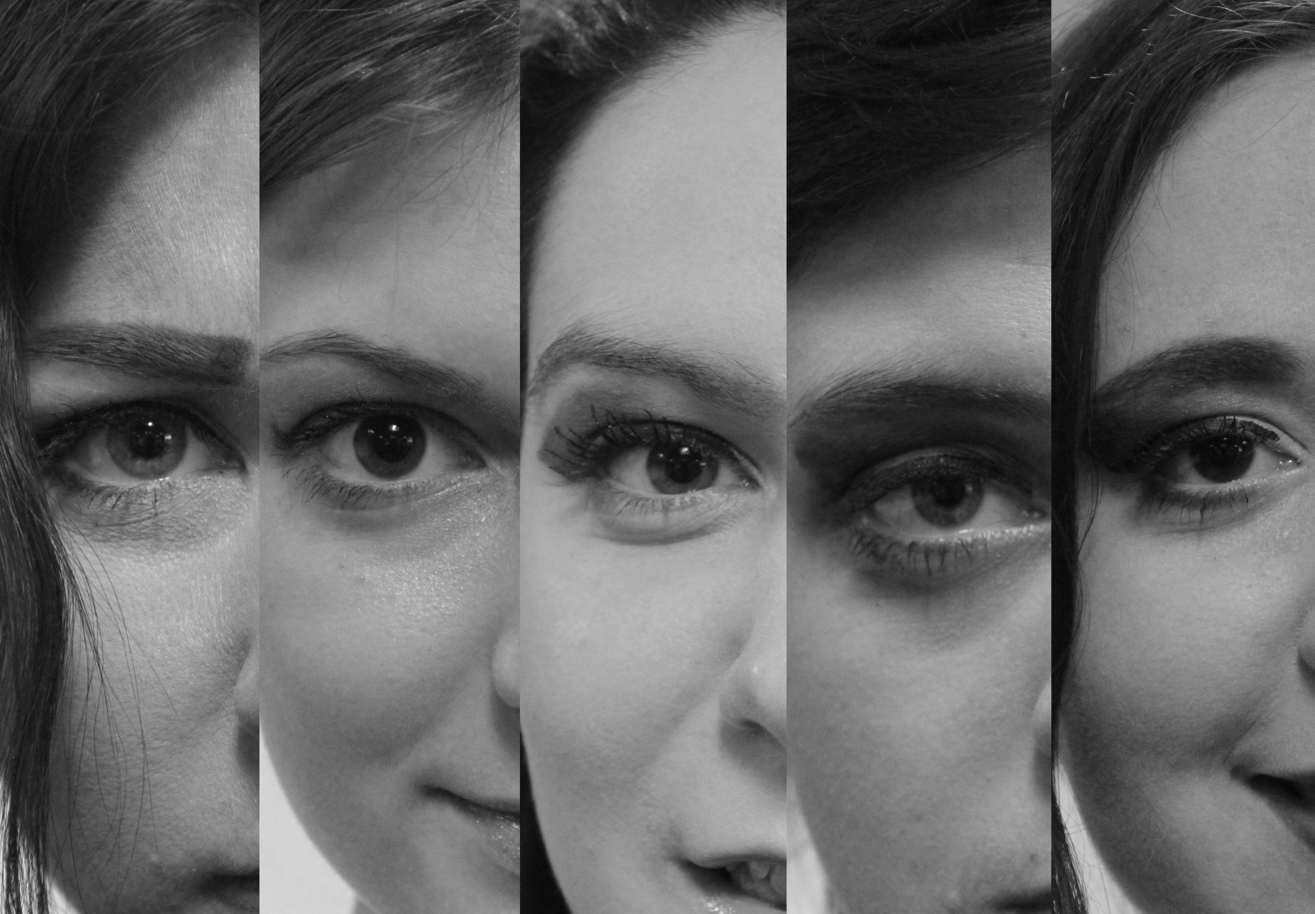
This way of having each person clearly shown is nice but has barely any relevance towards our piece because it clearly shows the 5 different actresses.

I like how this photo shows five different faces put together to be one person, however as this was not the aim heading into the photoshoot the faces don’t really match up. If we were to continue on with this idea we would have to have done a new photoshoot.
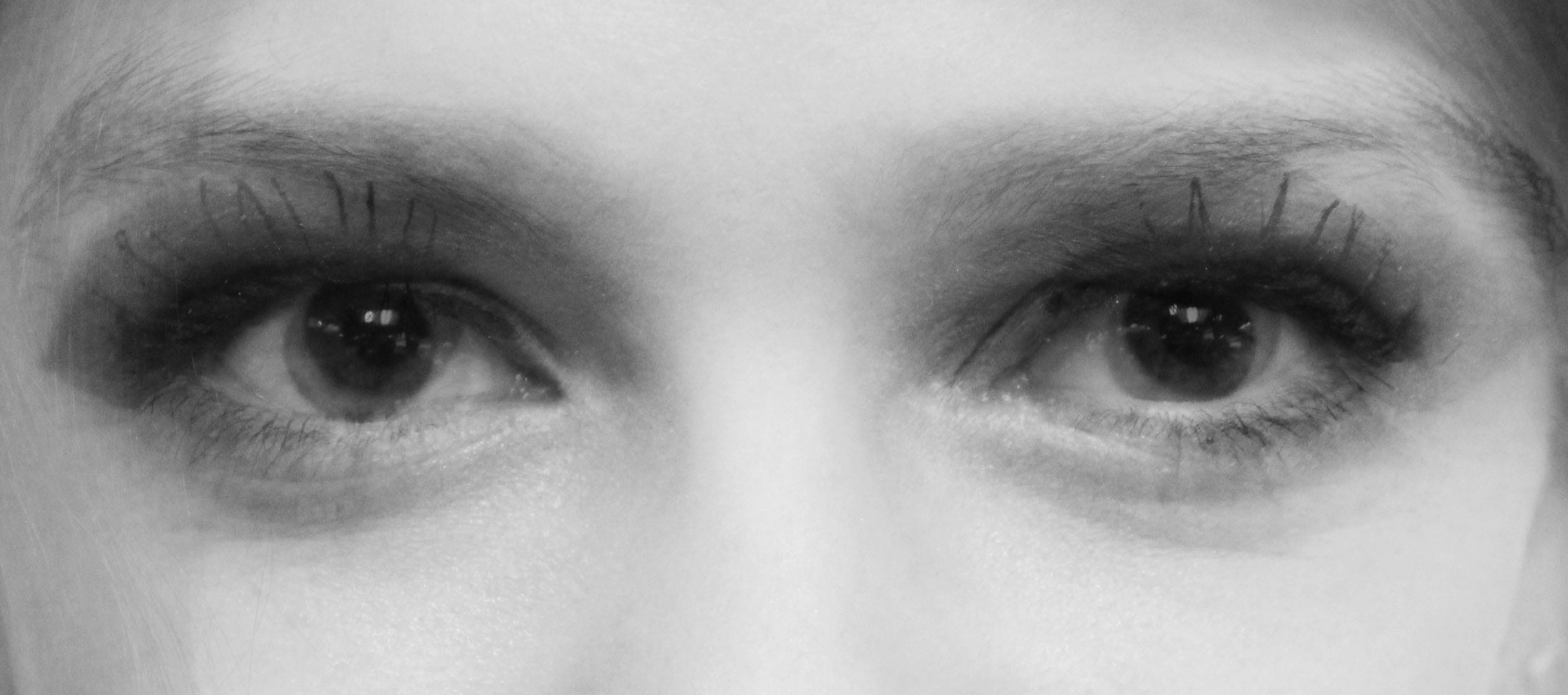
This was our finished photo in colour, black and white. We sent these photos off to the marketing manager of LPAC Julie to see what her opinions of the photos were. She got back to us saying that the photos lacked intensity. So we went back to the starting board.